PROCESS
Typically, I start with sketches - but since this was a larger project that would involve more brainstorming and lots of sketch iterations - I started with my brand objective, mission statement, and design objectives. This helped me state exactly what I was hoping for my project to do and how I would hope it'd be viewed as.
I originally named this website - Protestors United - because I intended this site to be a place that offered protestors or would-be protestors an easier platform to gather, to discuss their plans, and to be more unified in their actions when the day of protest arrives.
However, after receiving constructive and helpful criticism from my peers and professor, most of whom said that Protestors United seemed to exclude more than include and that I must find a way to make the website less about protesting as an action but as a series of questions that gives the people answers they're looking for.
- what are they protesting?
- why are they protesting?
- who are they protesting?
These questions would help me finalize on the goal and name of my website.
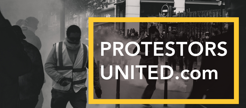

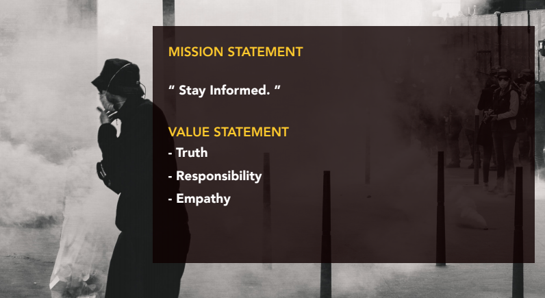
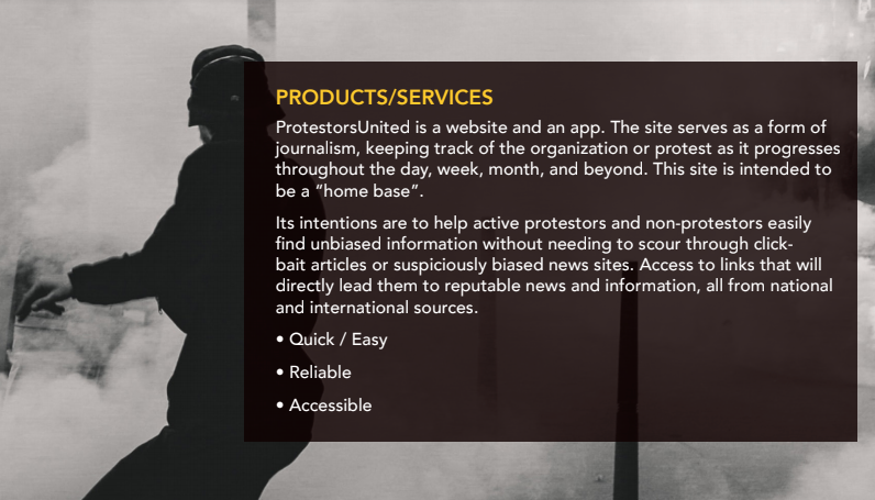

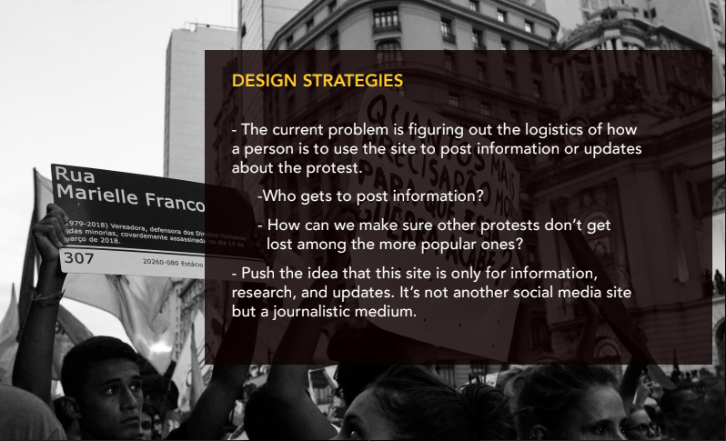
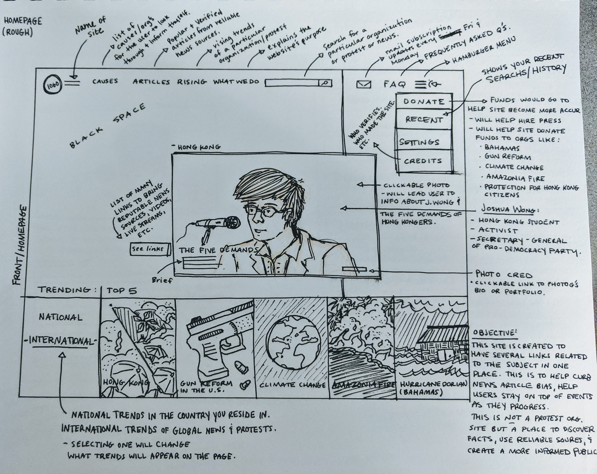
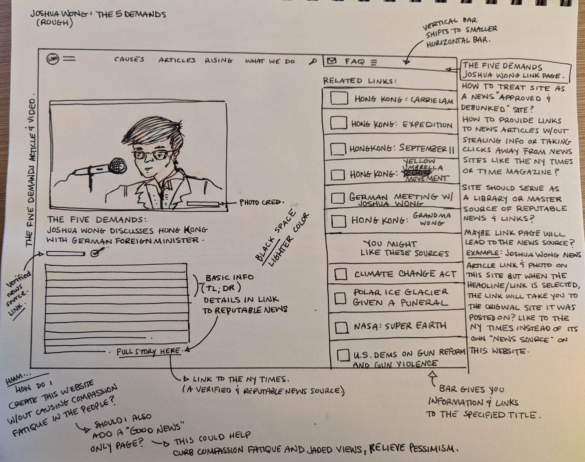
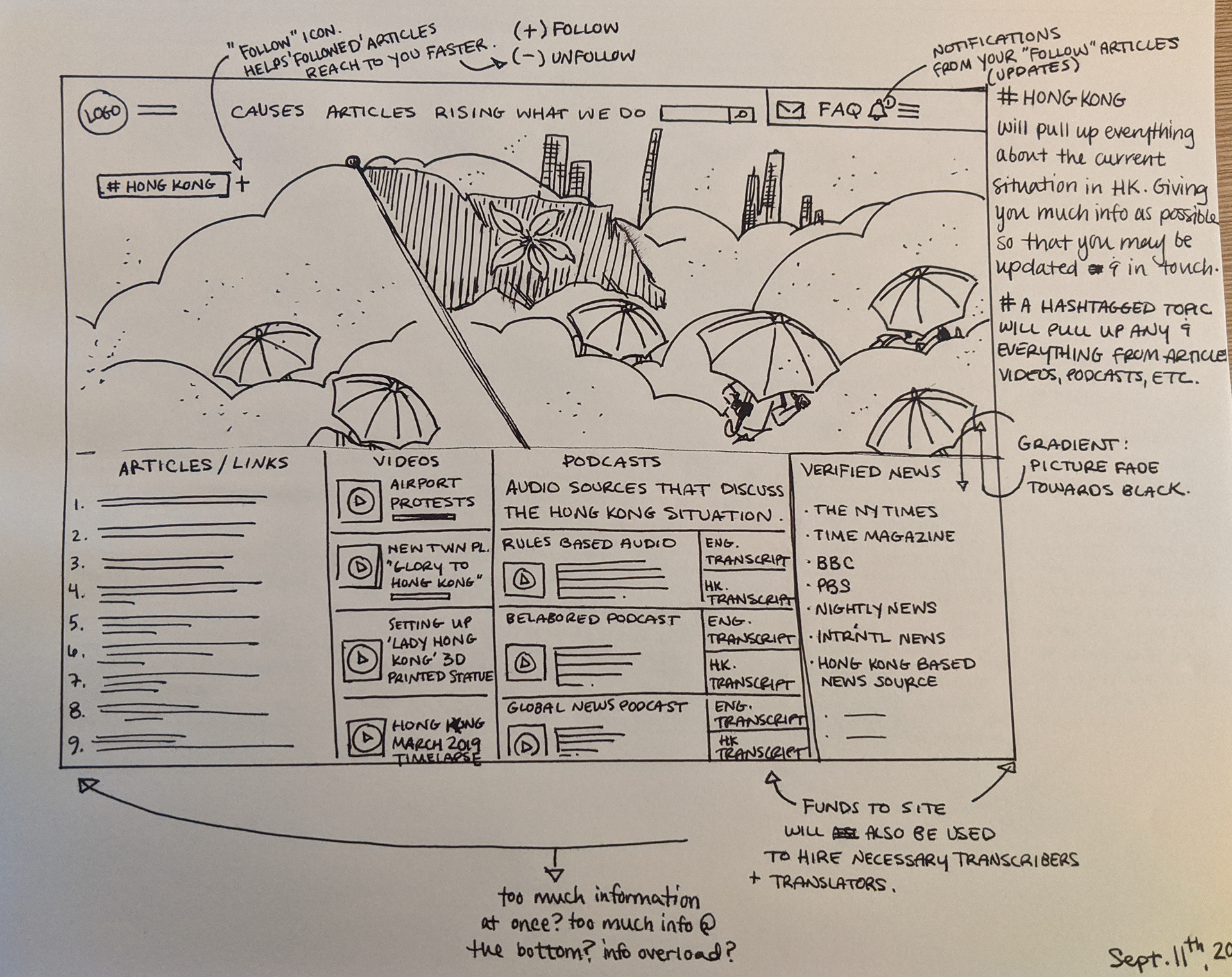
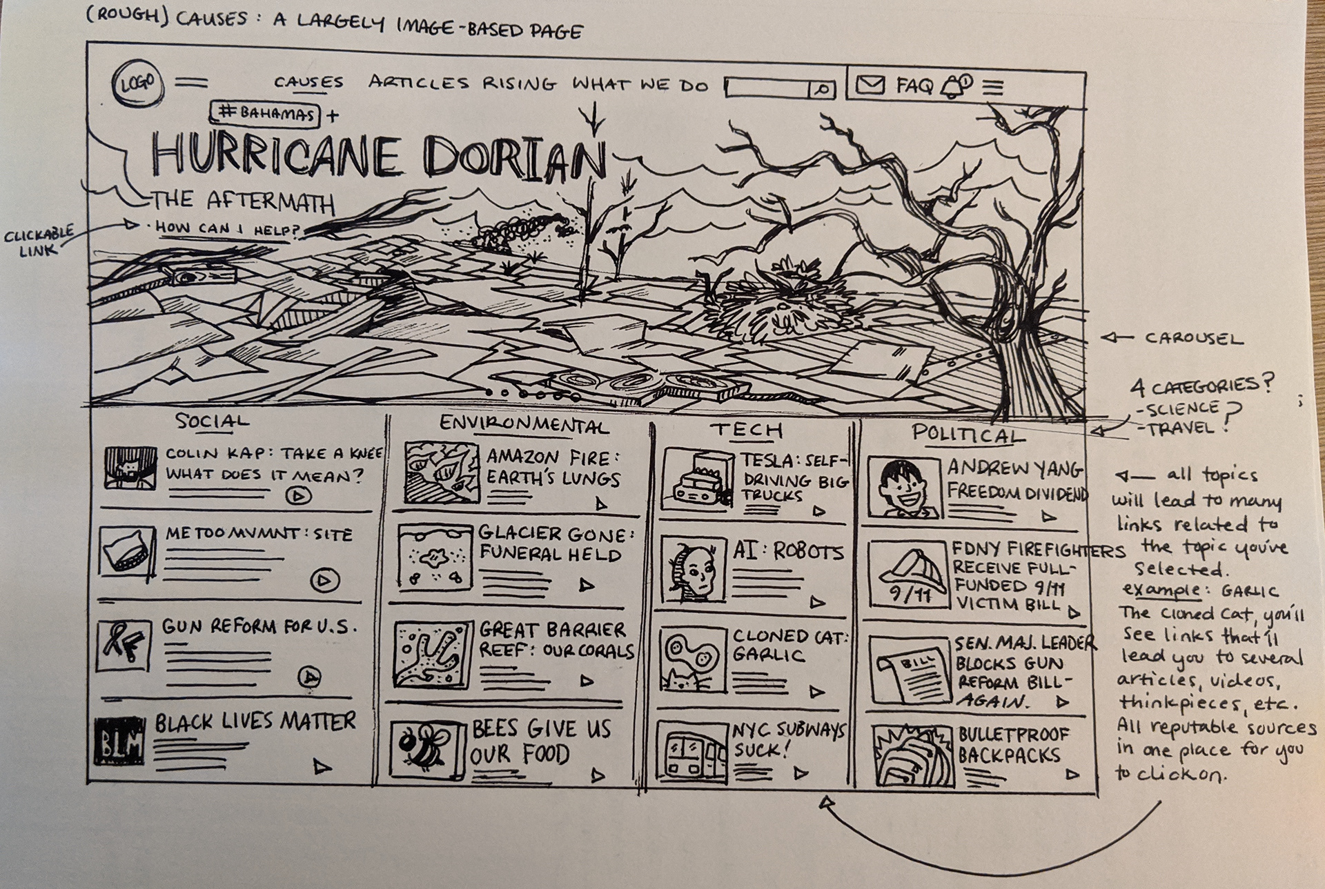
These are the sketches I've created that helped me further envision my website. As you can see, I wanted to create a site that informed as well as provide users series of information that they could use without needing to go to other search sites and scour through articles that may be biased or misinformed. This site is essentially a hub of reliable links, videos, and other important pieces of information.


BRANDING
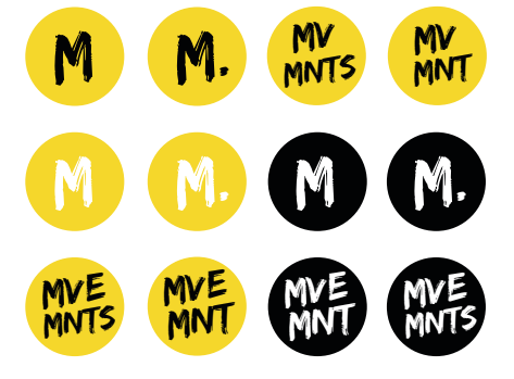
Logo Concepts.
The yellow and black color scheme seemed to be the obvious choice as when the two colors are paired together, they usually represent warning, danger, or attention.
I wanted this website not to just receive attention but also keep the attention, and pique interest.


Final logo concept